The 3 pillars: office design for creativity
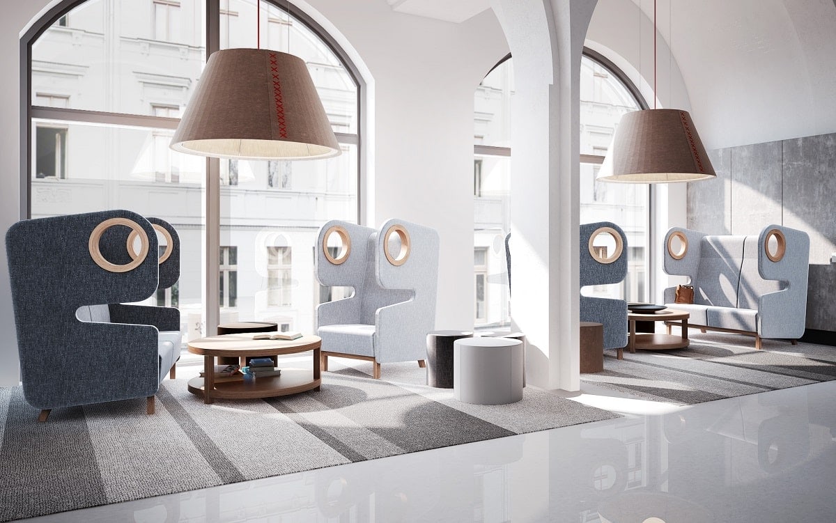
In the words of Winston Churchill, “We shape our buildings, and afterwards our buildings shape us.” So how might we shape the office for creativity?
Office design for creativity – tl;dr
- Togetherness. Model your social zones in the office after English coffeehouses of the 17th/18th centuries; bring people of all functions together over something universal, like coffee or entertainment. Creativity seeds when paradigms collide, producing cross-pollination and knowledge spillovers. The lively chatter in an office watering hole (like a well-furnished cafeteria) can be intellectually nourishing.
- Seclusion. Allow employees to isolate themselves from each other as needed by providing seclusive spaces. Seclusive spaces should sound calm, look calm, and feel calm. They’re fit for independent work as well as mere relaxation. Chiefly, they’re free of metaphorical noise.
- Agility. Opt for flexible furnishings so employees can move through and interface with their workplace in an agile way, making adjustments without fuss. Consider the iconic Building 20 — it showcases the value of agility in workplace design perfectly. Hosting an unusual volume of breakthrough discoveries, Building 20 was elementally agile, as residents could tinker its interior to their needs.
Creativity is a living thing, fickle and delicate. It happens through the natural congregation and self-isolation of employees as they move through their workplace in an intuitive, cat-like way to satisfy needs. It can’t be forced or tricked out, only encouraged by design
– says Eliza Donek, Product Manager, Mikomax.
Pillar #1: Togetherness. Set the stage for socialization.
“The most creative spaces are those which hurl us together. It is the human friction that makes the sparks,” says author Jonah Lehrer, who has eagerly explored how creativity works in numerous books and thought pieces.
Consider English coffeehouses of the 17th & 18th centuries.
Socially vital. Eclectic — a merging of dissimilar modes of thought (think multiple departments, in the case of the office).
Unpredictable. Aburst with zeal. The London coffee house was a truly inspired setting.
It was an engine of innovation that brought on the Enlightenment. Ever so organically, it fostered the togetherness that can apparently produce brilliance.
How to realize a vibe of innovation on par with the London coffeehouse? Bring people together over something all have in common, like coffee or sports. And in a central place — a fully appointed cafe, perhaps, in the heart of the office, equipped with power modules and several furniture settings. Make it a place where people not only want to be but where they can work should a good thought arise in conversation
– offers Eliza Donek, Product Manager, Mikomax.
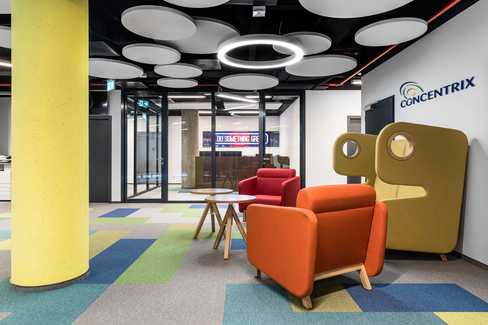
Magic happens when paradigms blend.
Knowledge spillovers and cross-pollination are the stuff of creativity. Often, when an employee is lost in the weeds, a peer’s different way of thinking about things can be all the perspective they need to see the big picture again.
Where does your team tend to gather? Pour more thought and care into that space.
What are their favorite aspects of their go-to watering hole? How could it be improved? Model any retrofits on feedback gleaned. You want a meeting of the minds — different fields and expertise colliding — employees from all departments and functions mingling, feeling out synergies.
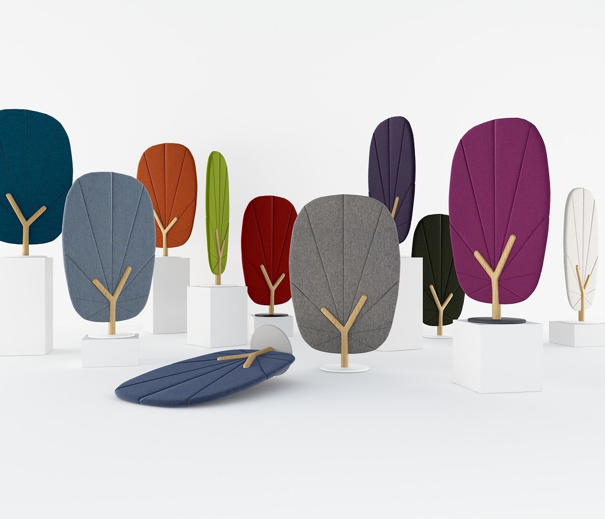
Account for noise by plotting a selection of acoustic solutions, from baffles to booths.
The most innovative spaces of all time depended on discourse. Of course, sound insulation of speech can be tricky in open offices. Try a few Hushoffice booths (guaranteed speech privacy) for peers to speak fervidly within without upsetting others. An array of screens, wall panels, and ceiling tiles will help, too.
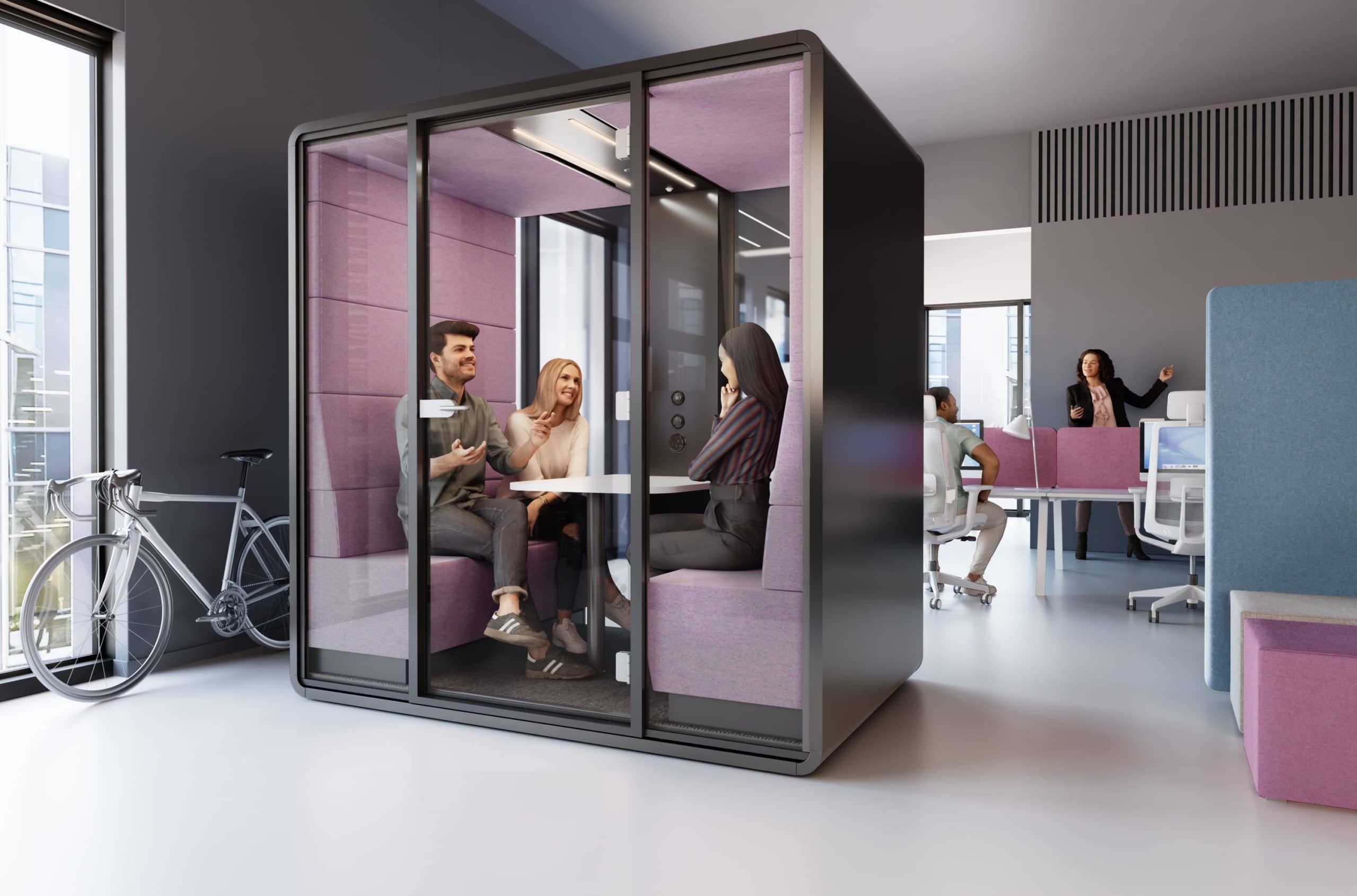
Pillar #2: Seclusion. Allow employees to isolate themselves from each other.
Though the imagination can be stimulated by chit-chat and collaborative work, there are steps in the creative process that require independent focus. After all, ideas need time to incubate, too.
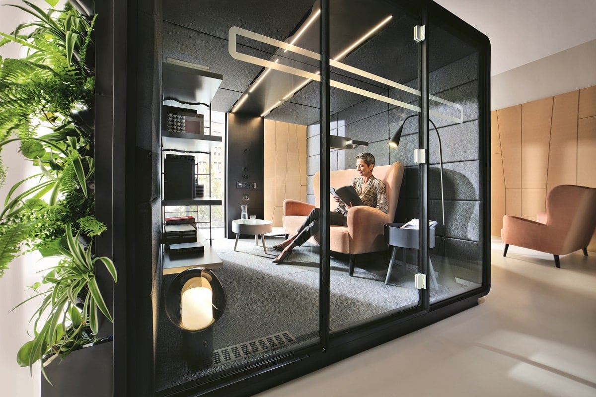
Employees need to be able to withdraw from the office to think deeply or integratively.
Seclusive spaces are quiet and clutter-free. They don’t need to be assigned, but they should feel personal; the employee must have no qualms about claiming the space for the moment, settling in, and sussing out complicated matters alone. Convenience, comfort, and accessibility are key here.
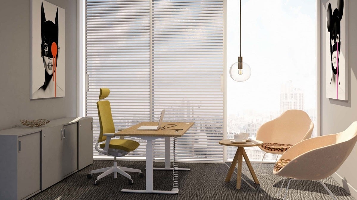
In seclusion, an employee can work out the kinks of their thinking without judgment.
A sense of seclusion is created acoustically, visually, and architecturally. So the space sounds calm, looks calm, and feels calm. The person inhabiting it can let their mind wander (or pull in its reins) with undivided focus, unbroken by interruptions. They are shielded from metaphorical noise.
Remember: eureka moments typically occur when we’re chilled out.
Eureka! Sudden clarity. When information coagulates into a breakthrough. Happening when we’re unplugged and often during solitude. So devote some of your seclusive spaces in the office to relaxation alone. Employees will have a spot where they easily detach from work, giving rise to “Eureka!”
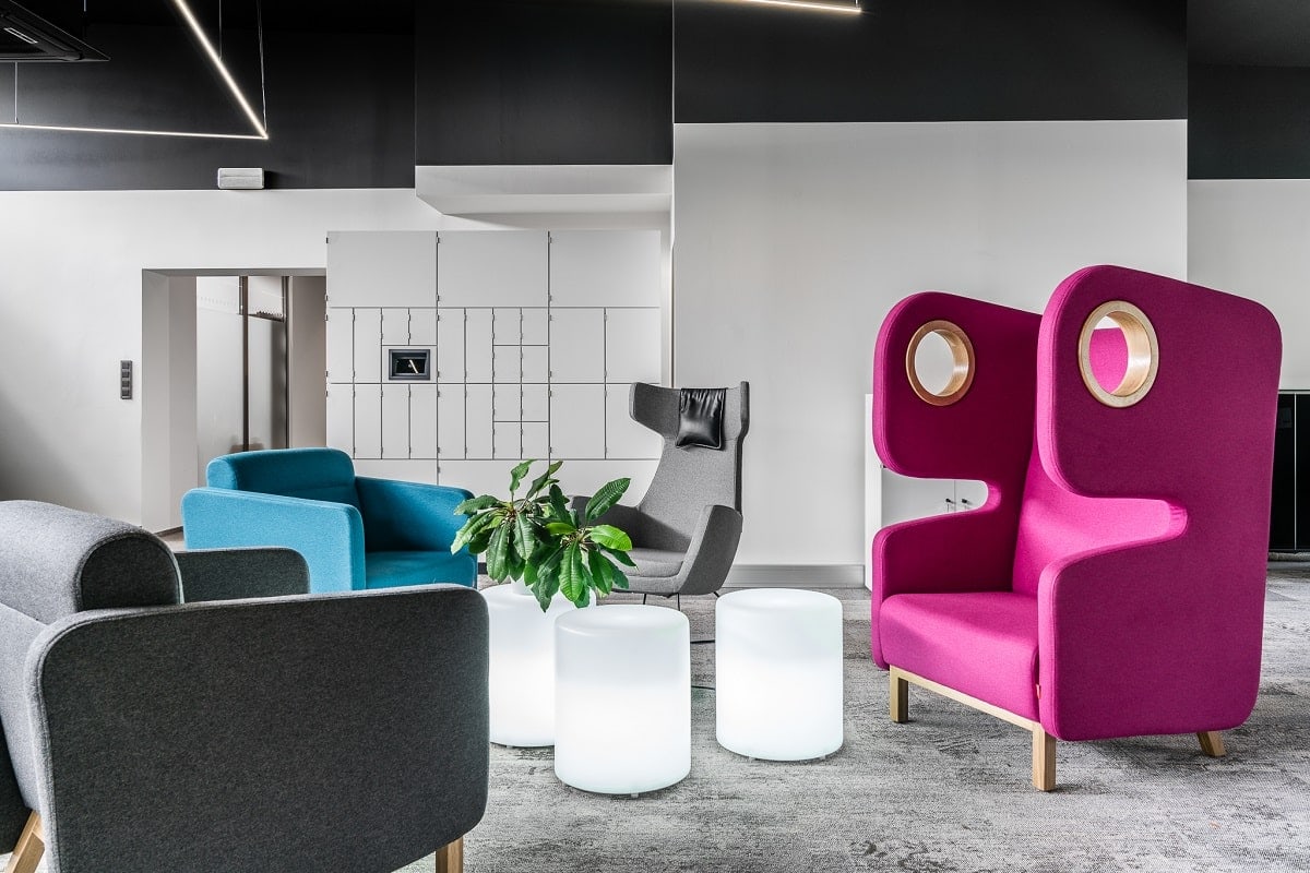
Pillar #3: Agility. Ensure your team can flow through the entire office space freely.
Make the office agile through flexible solutions and you allow employees to move — agile and ad-lib — throughout it, making easy adjustments off the cuff.
Creativity is capricious. Agility in the office’s build helps you keep up with it.
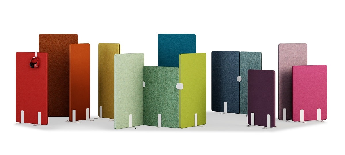
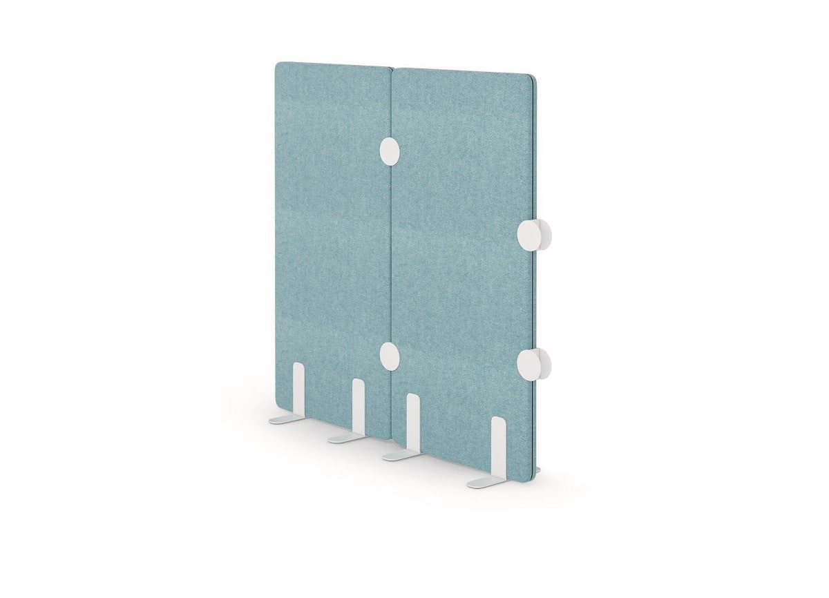
It’s as simple as being able to rearrange partitions for momentary separation. Say a peer thinks up an unconventional fix, odd as it is promising. They want to draw it right away but need the comfort of a relaxed yet intimate space. Agile partitions like SONIQ allow them to fashion this space.
When an office is adjustable, a generative relationship forms between it and its workforce.
Employees can tweak the workplace to their liking. So they enjoy a grounding sense of ownership over it. And, ultimately, better productivity thanks to a fine-tuned, more effective work setup (one they can adapt in step with their evolving preferences).
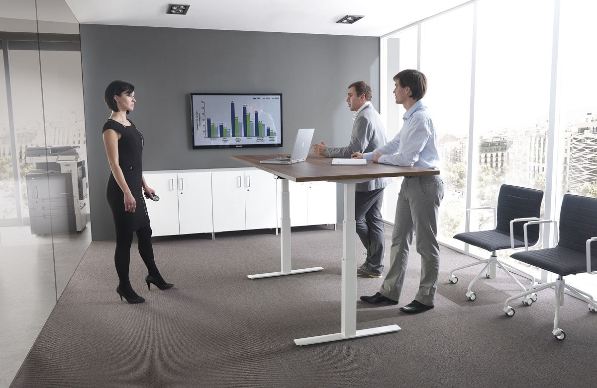
Agility is about the little affordances that lend freedom.
An employee zips up to a standing position at their height-adjustable desk and accesses an abstract angle on the problem, which helps solve it. Or they reposition the breakout hub’s dividers to give more privacy to a meeting attendee that’s always shy but full of novel insight.
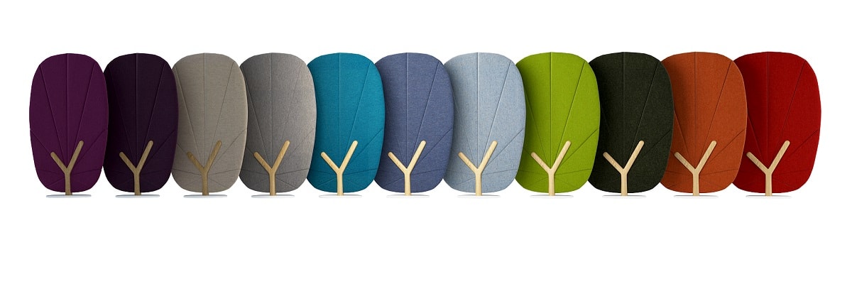
When the employee is locked into a rigid layout, they are simply subject to its limitations. This can be dispiriting, leading to low morale and productivity loss, especially if their space is ergonomically unsound. So aim to make the layout as retool-able as possible. Opt for modular, movable, adjustable furniture pieces every step of the way
– says Eliza Donek, Product Manager, Mikomax.
The iconic Building 20 illustrates the value of agility in workplace design.
Building 20 was one of the most creative spaces in modern history. It saw heaps of world-changing innovations. And analyzed through the lens of space planning, its most distinct aspect was agility; researchers who worked there had free reign to manipulate its layout since the building was temporary.
Far from lifeless or static, Building 20 was animated by its people.
This concept can be applied to the office through the use of movable space dividers, adjustable sit-stand desks, and modular benching systems — flexible solutions that give the employee more autonomy over their space.
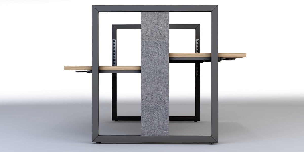
Today’s office should offer a sense of movement.
A lounge abuzz with talk, a pod that hushes noise, and effortless movement between the two. This is the ideal balance. For creativity happens in motion. Socialization should be fostered, with seclusion always at hand and movement between the two, plain sailing.
Office design for creativity – tl;dr
- Togetherness. Model your social zones in the office after English coffeehouses of the 17th/18th centuries; bring people of all functions together over something universal, like coffee or entertainment. Creativity seeds when paradigms collide, producing cross-pollination and knowledge spillovers. The lively chatter in an office watering hole (like a well-furnished cafeteria) can be intellectually nourishing.
- Seclusion. Allow employees to isolate themselves from each other as needed by providing seclusive spaces. Seclusive spaces should sound calm, look calm, and feel calm. They’re fit for independent work as well as mere relaxation. Chiefly, they’re free of metaphorical noise.
- Agility. Opt for flexible furnishings so employees can move through and interface with their workplace in an agile way, making adjustments without fuss. Consider the iconic Building 20 — it showcases the value of agility in workplace design perfectly. Hosting an unusual volume of breakthrough discoveries, Building 20 was elementally agile, as residents could tinker its interior to their needs.
Designing workplaces that foster creativity – frequently asked questions
Is the STAND UP R height-adjustable desk powered electrically or manually?
STAND UP R is a manually powered desk.
Does the TREE acoustic screen come in different colors?
How tall is the SONIQ space divider?
Our SONIQ partitioning system is available in 20 size combinations. Check them all out at the product’s page.
